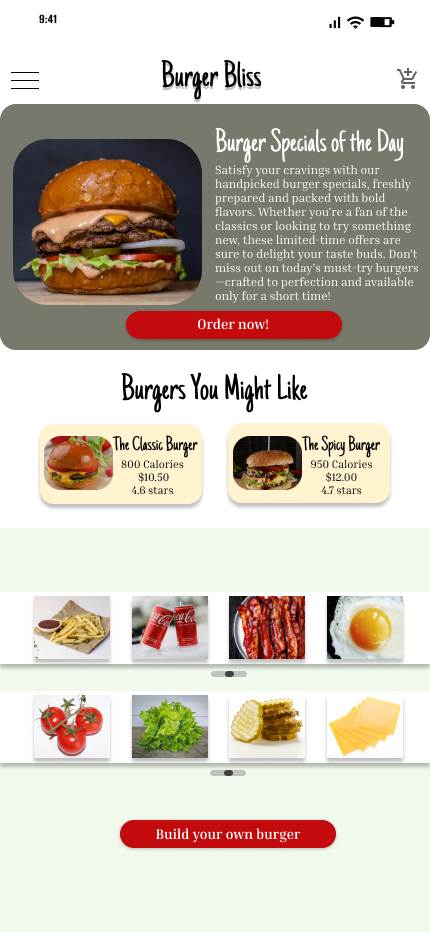
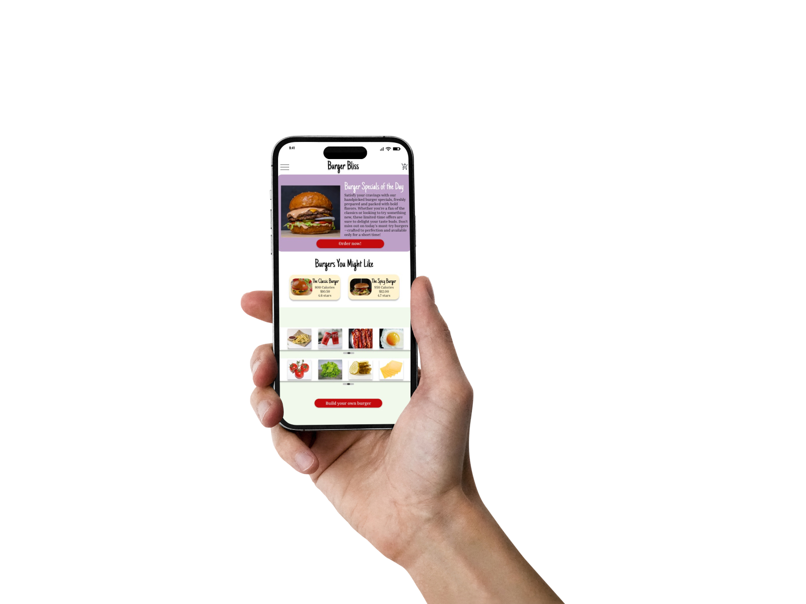
1. Research & Problem Identification
Before diving into the design, I conducted user research to understand the needs and pain points of the target audience. The core problem identified was that users often found it frustrating to navigate through overly complex menus and order processes. They wanted a simple and seamless experience when browsing and customizing their burgers.
2. Low-Fidelity Wireframe
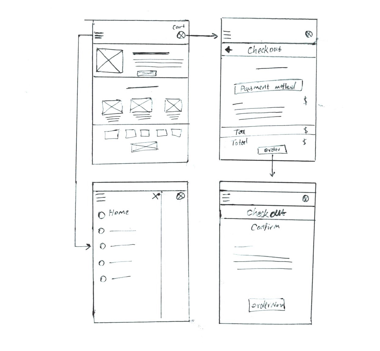
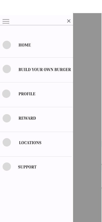
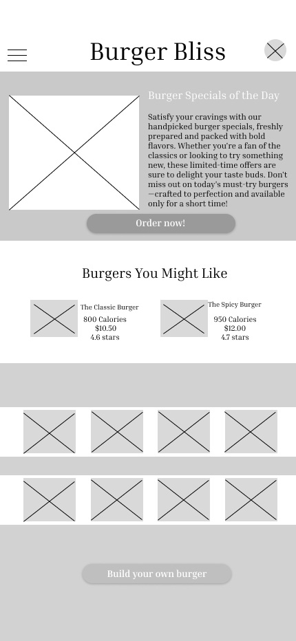
In the initial stages of the design process, I created a low-fidelity wireframe to map out the user journey.
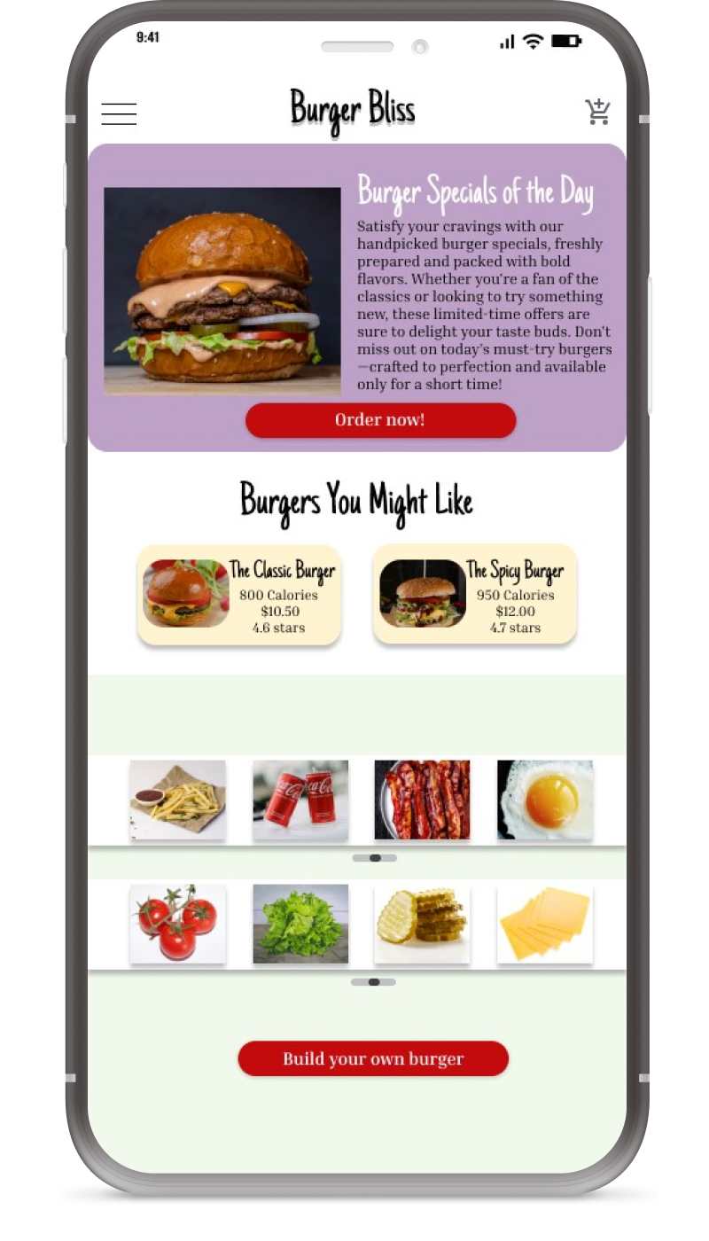
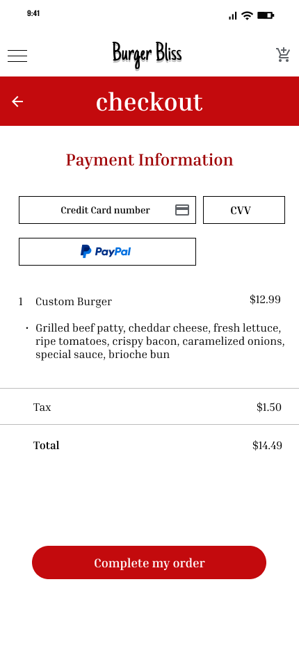
- The wireframe was focused on laying out the basic structure, including the home screen, burger selection page, checkout flow, and payment confirmation.
- The goal was to prioritize functionality and flow without worrying about visual design at this stage.
Key Features in Low-Fidelity:
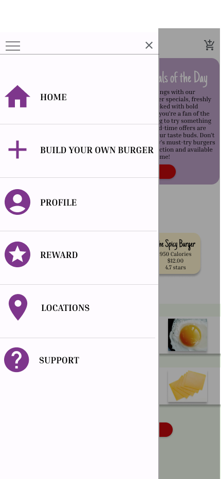
- Basic navigation bar with links to essential pages (home, cart, checkout).
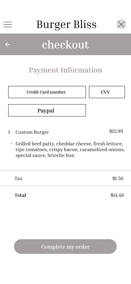
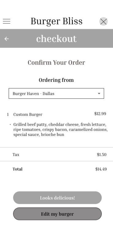
- Checkout flow was simplified with payment method and order confirmation screens.

